Yoga by Loriana
Busy individuals face challenges integrating yoga into their daily routines due to time constraints and misconceptions about accessibility. Current yoga apps lack a comprehensive solution that combines online practice, in-studio booking, and short, targeted sessions for specific needs. As a result, users struggle to find an effective way to incorporate yoga and holistic wellness practices into their hectic schedules.
by Kit Siu
End to End Application
Role:
UX/UI Designer
Duration:
95+ Hours
Project Type:
End to End MVP Application
Tools:
Figma, Lyssna, Adobe Illustrator, Adobe Photoshop
My Process
Discover
Define
Ideate
Design
Problem Statement
Busy individuals face challenges integrating yoga into their daily routines due to time constraints and misconceptions about accessibility. Current yoga apps lack a comprehensive solution that combines online practice, in-studio booking, and short, targeted sessions for specific needs. As a result, users struggle to find an effective way to incorporate yoga and holistic wellness practices into their hectic schedules.
Objectives & Goals
The primary goal of the Yoga by Loriana app is to provide a comprehensive and accessible yoga experience that fits seamlessly into users' busy lives. I worked with Loriana, a passionate yoga instructor, who is starting her journey to build her own yoga business and expand yoga's reach to a wider audience.
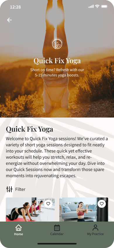
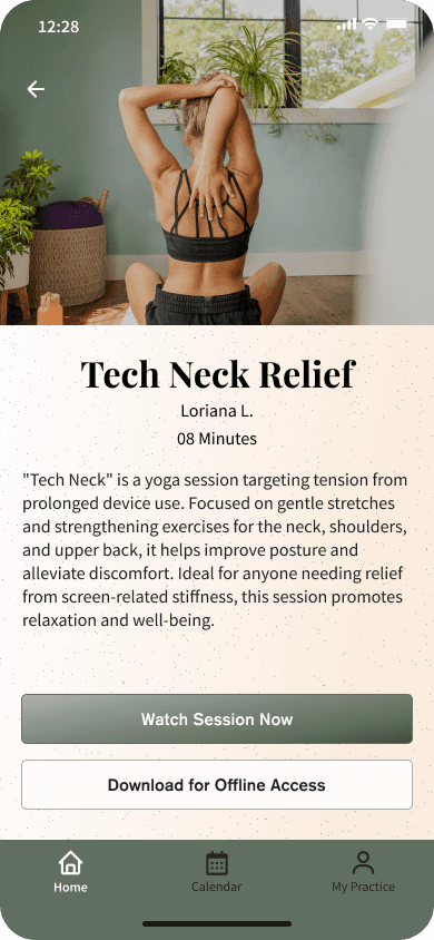
Objective: To offer a mix of online and in-studio yoga sessions, including short, targeted "quick fix" sessions for daily needs like stress relief and physical wellness. The app seeks to make yoga more inclusive and adaptable to various schedules and wellness goals.
Insights from
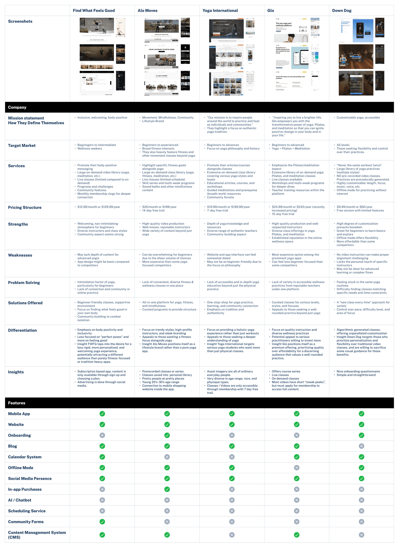
Competitor Analysis
Few competitors offer both online classes and in-studio sessions together.
Emphasis on body-positive, accessible yoga practices is a growing trend.
Content can be overwhelming for beginners; there's a need for tailored "quick fix" sessions.
There's demand for holistic wellness, including meditation and mindfulness, alongside physical practice.
Personalized and supportive user experiences are crucial for retention.
Competitive pricing and trial periods are essential for attracting users.
Unique features like algorithm-generated classes and friendly community environments are valuable.
Click On Images To Enlarge

Interviews
Stakeholder Goals:
Yoga By Loriana’s MVP aims to make yoga and holistic wellness practices accessible to everyone, regardless of time or financial constraints. By focusing on short, varied practices and incorporating energetic healing and self-care, the MVP challenges misconceptions about yoga and reaches a broader audience. Future iterations will continue to build on this core, guided by user feedback and evolving stakeholder vision.
User Goals:
Users want to integrate yoga into their diverse and hectic lifestyles, seeking stress relief, physical wellness, and deeper self-care within limited time frames. They value a platform that offers traditional yoga and holistic wellness practices.
Needs:
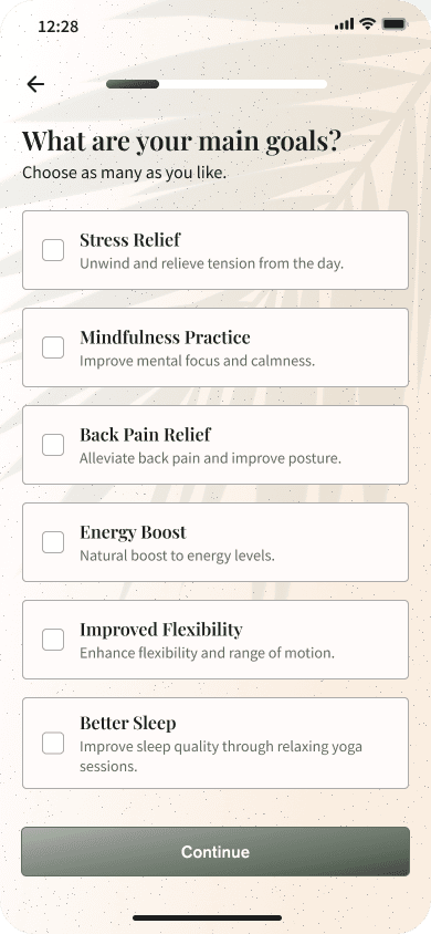
Brief, targeted sessions that fit into daily routines.
Personalized user experience with adaptable content.
Robust scheduling and payment tools.
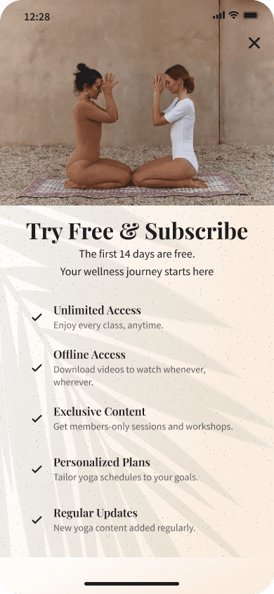
Offline access to content for anytime, anywhere practices.
Affinity Mapping
Creating an affinity map helped me categorize and understand user needs, preferences, and challenges by grouping similar insights and themes from my research.
Key Takeaways
1. Yoga Practices and Preferences
Range and Versatility: The platform should offer a variety of yoga practices to promote balance and inclusivity, catering to both individual and collective wellness.
Yoga Integration: Users seek a unified app that blends traditional and modern practices, offering versatile and culturally relevant sessions.
Work-Life Balance: Yoga is viewed as essential for managing work stress and finding balance, acting as a grounding anchor in fast-paced lives.
Short and Accessible: There’s a strong need for quick, adaptable yoga sessions that fit into various schedules and spaces, accessible to all.
2. Target Audience
Inclusivity and Engagement: Users desire an authentic, inclusive yoga journey that merges mindfulness with modern technology. A community space for sharing, learning, and connecting is crucial, yoga enthusiasts.
Young, Diverse Audience: The app aims to engage a youthful, diverse audience, focusing on genuine interactions to broaden yoga’s community impact.
3. App Design and Features
Serene Design: Users seek a visually harmonious app that reflects the ethos of yoga—calm, focused, and rooted in natural aesthetics.
Educational Content: Users prefer uplifting, easily digestible yoga content that fits seamlessly into their daily routines.
Personalization: The app should offer an interactive experience that adapts to user feedback and lifestyle, fostering personal growth.
4. User Needs and Challenges
Tailored Experiences: The app must balance authenticity with technological convenience, addressing work-life stress and providing quick, adaptable sessions.
Scheduling and Payments: Users need a straightforward, flexible system for session booking and payments, accommodating spontaneous schedules.
These insights guided the app's design, ensuring it meets user expectations and addresses their pain points.
Click On Image To Enlarge

User Persona

Background
Represents a range of individuals in the 20s to 40s age bracket, reflecting the client's active user base.
Comes from various professional backgrounds, indicating a wide array of users who find value in integrating yoga and wellness into their busy lives.
Geographically diverse within the regions served by the platform, emphasizing the reach and relevance of the service.
May include both those new to yoga and those looking to deepen their practice, highlighting the platform's ability to cater to a spectrum of yoga experiences.
Needs
Short, targeted yoga practices that fit into a packed schedule
Personalized yoga sessions that cater to specific physical needs, offering tailored content recommendations.
A simplified and comprehensive booking and payment system.
Offline access for downloading content for yoga practice anytime, anywhere.
An inclusive yoga platform that feels welcoming and accessible
“
”
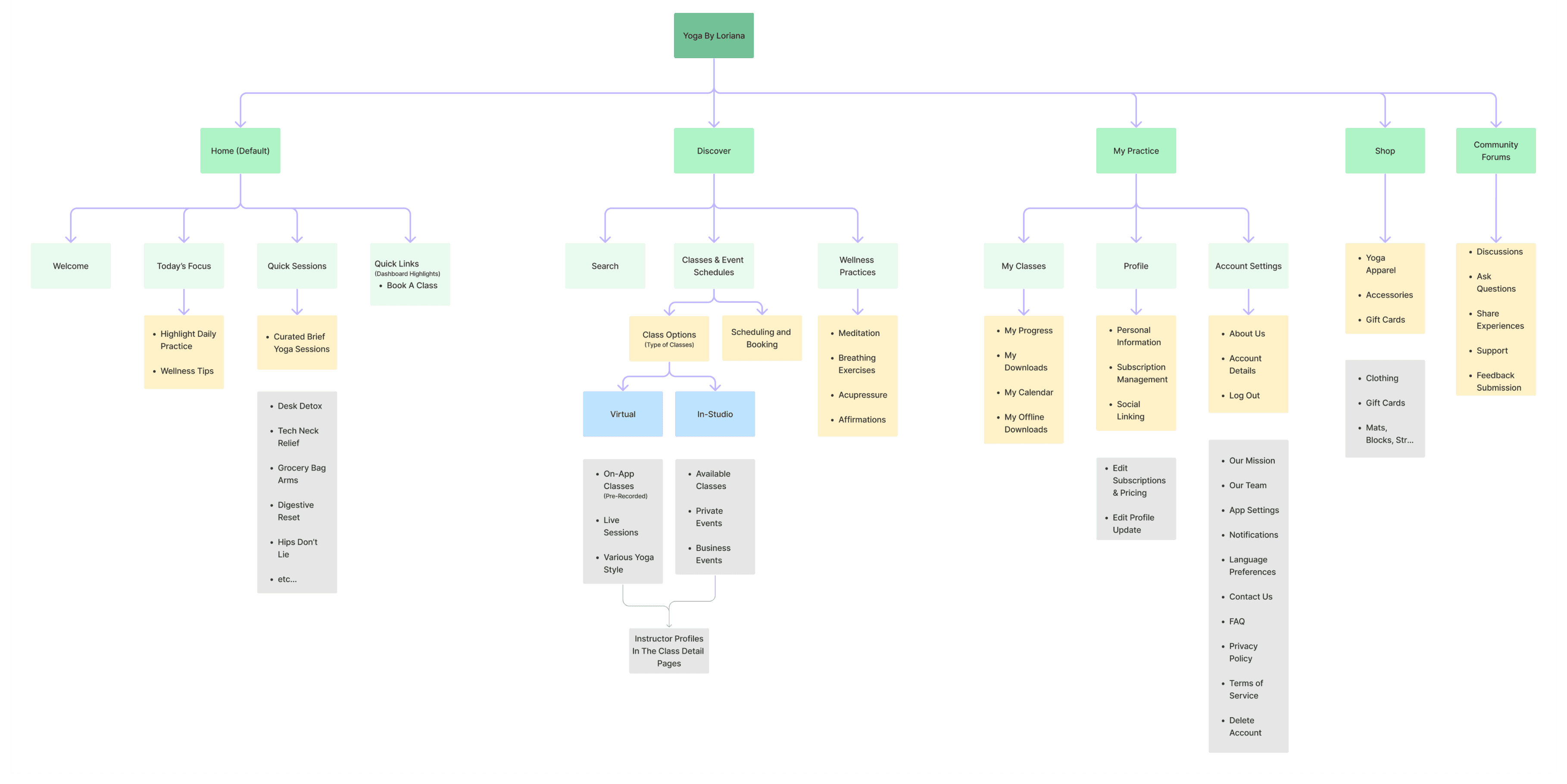
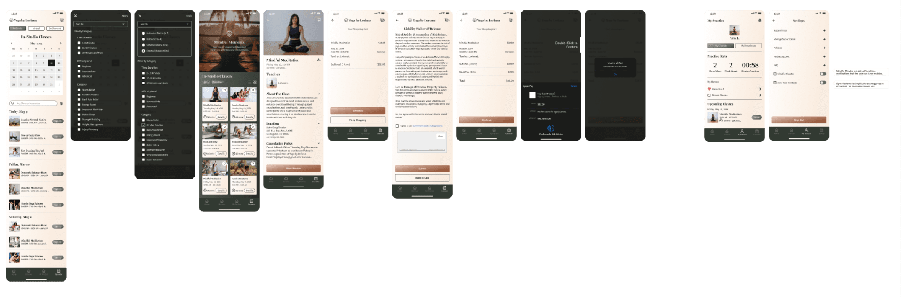
Sitemap
The sitemap was structured to make navigation familiar, drawing from common app layouts while addressing specific user needs identified in our research. It helped highlight overlaps and redundancies in content, ensuring that each section had a unique, purposeful function. For example, integrating the Quick Sessions under the Home navigation streamlined user flow, reducing confusion and making frequently accessed features more prominent and accessible.
Click On Images To Enlarge
Click On Flow To Enlarge


Click On Wireframes To Enlarge


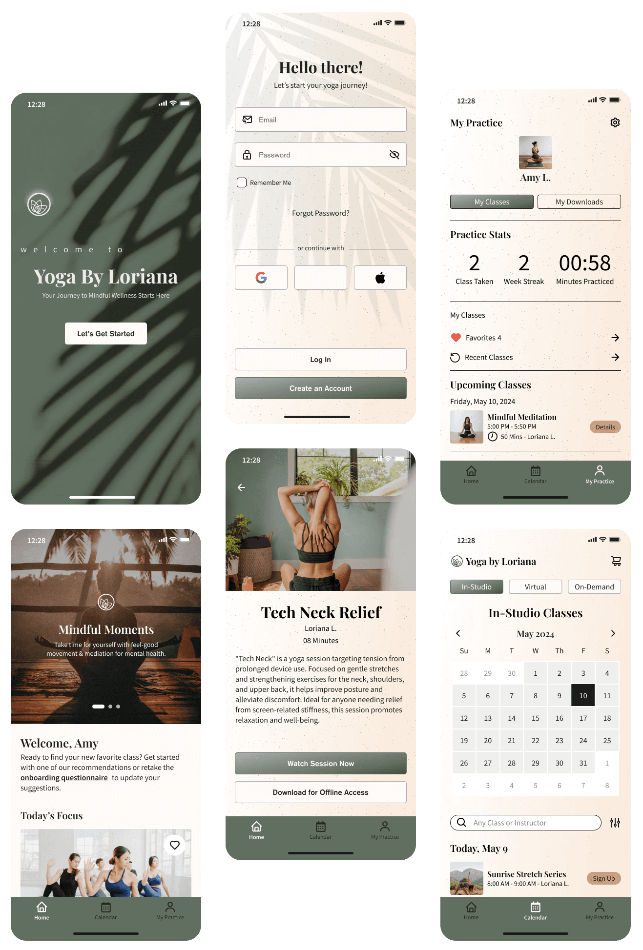
Moodboard, Logo Exploration, and Style Guide
Mood Board: The mood board captures the essence of Yoga by Loriana through core values like wellness, balance, mindfulness, and strength. It features a soothing palette of greens, browns, and neutrals, reflecting the natural and calming aspects of yoga, aiming to resonate with the users' desire for tranquility and holistic well-being.
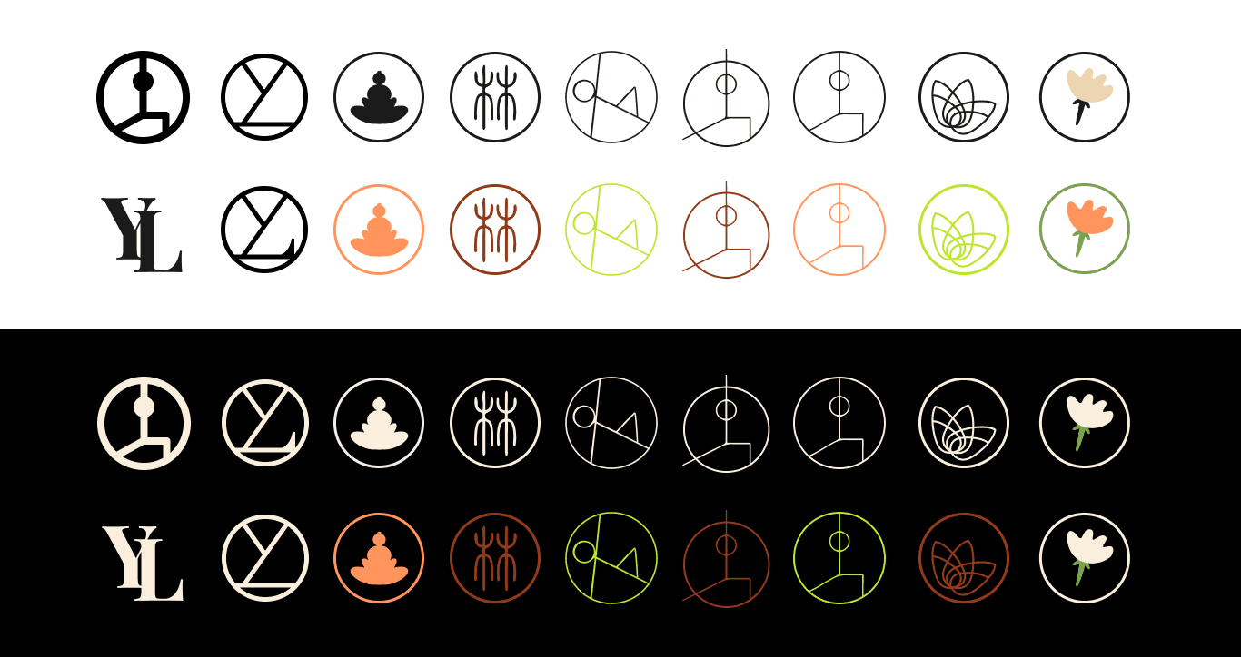
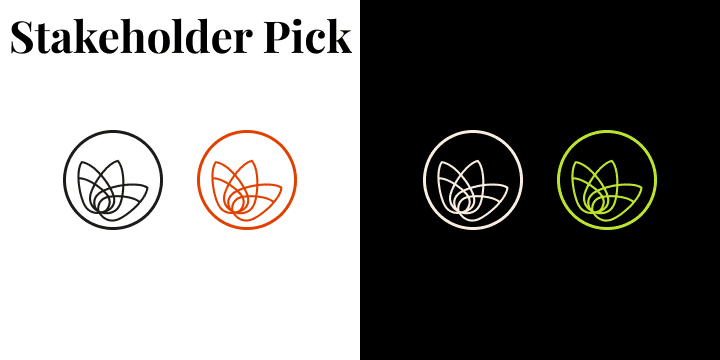
Logo Exploration: The logo exploration involved various yoga-themed motifs, incorporating the brand name and yoga poses. This process was highly collaborative, with stakeholders providing input to ensure the final design aligns with the brand's vision. The chosen logo reflects the elegance and simplicity of yoga, aiming to be instantly recognizable and evoke a sense of calm and balance.
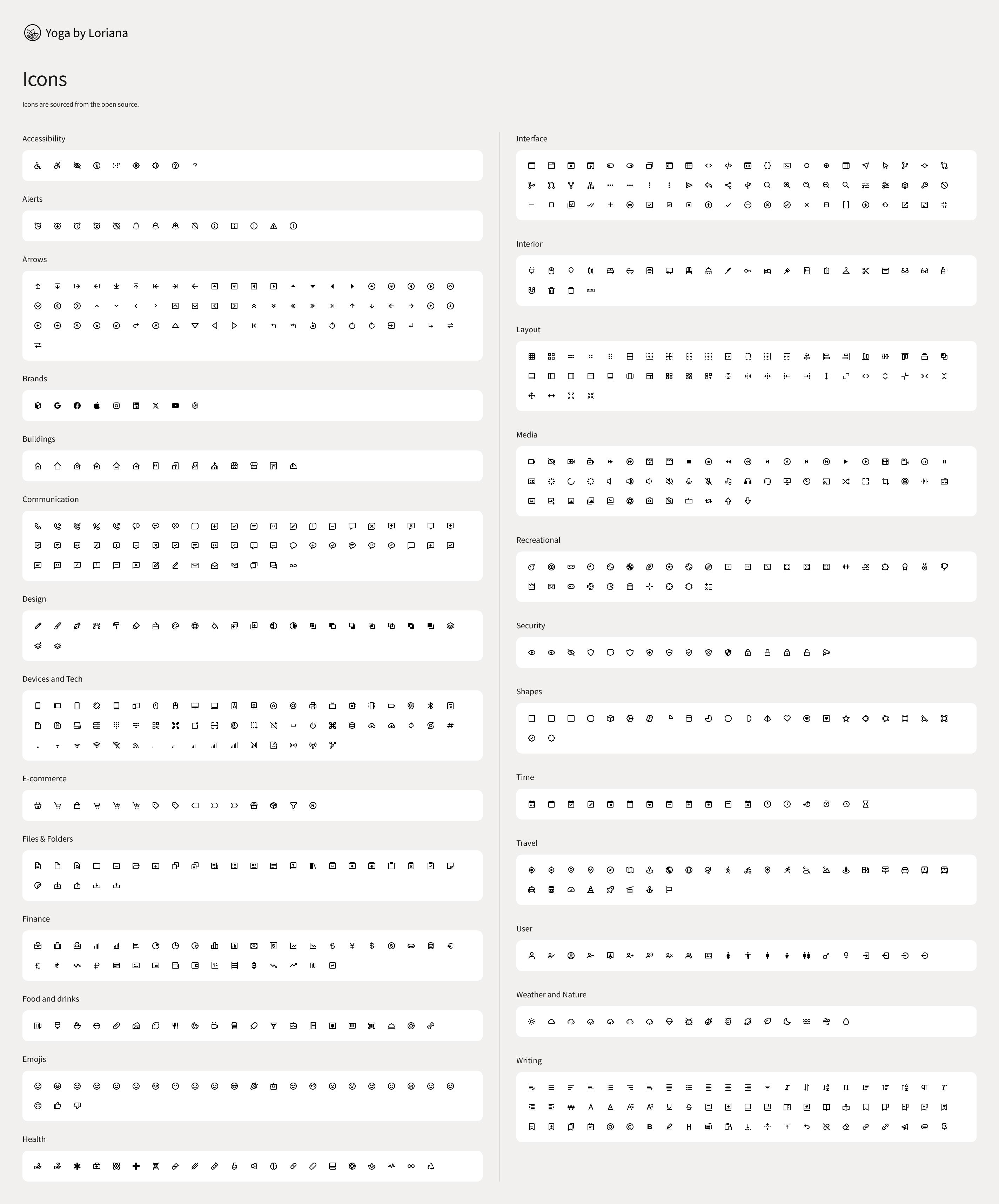
Style Guide: The style guide defines the brand's visual identity, including typefaces, icons, and colors. Playfair Display was selected for headings, paired with Source Sans Pro for body text, to create a harmonious and readable design.
UI Kit
The Yoga by Loriana UI kit has taught me that making early design decisions with a good UI kit really makes putting together websites and apps so much easier. Having everything organized with controlled elements makes the UI easier to read, navigate, and just look better overall. Plus, using a UI kit helps keep everything consistent, speeds up the design process, and makes it easier to work with others. It's a great way to ensure the final product is polished and cohesive, fitting perfectly with Loriana's holistic and user-friendly approach.


Click On Images To Enlarge
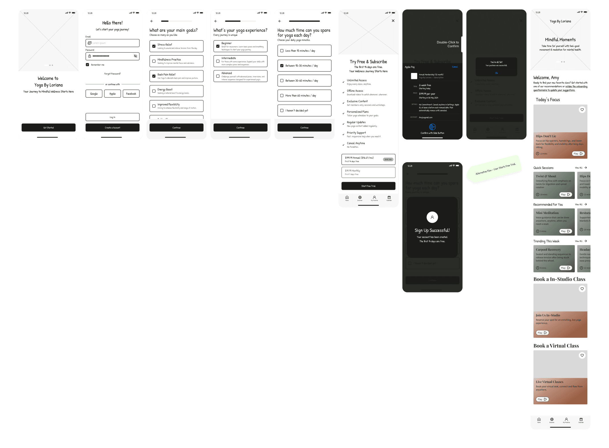
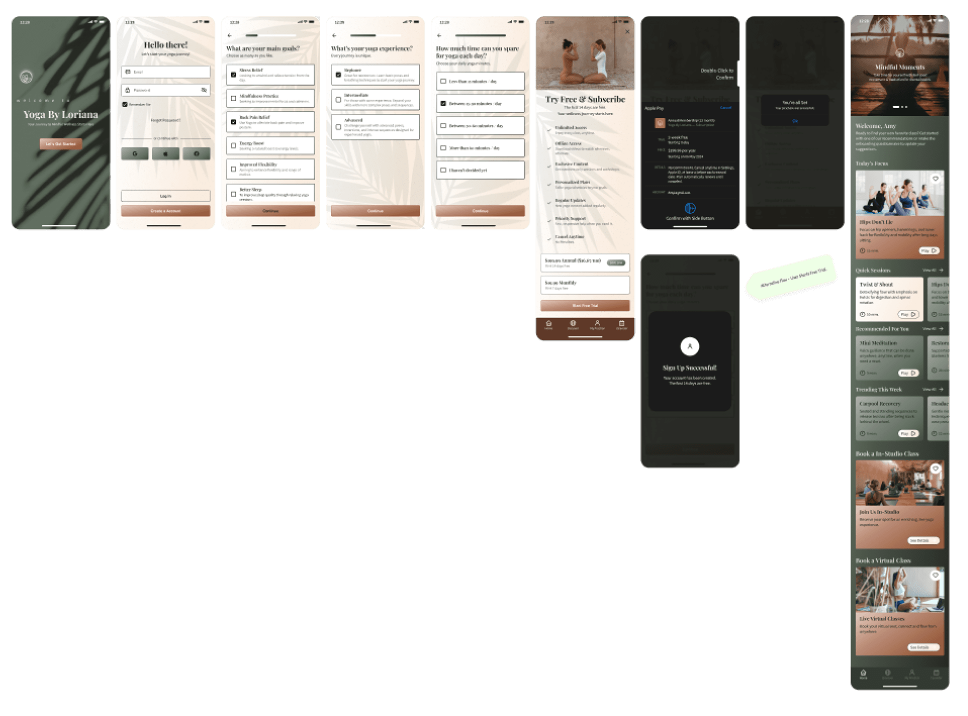
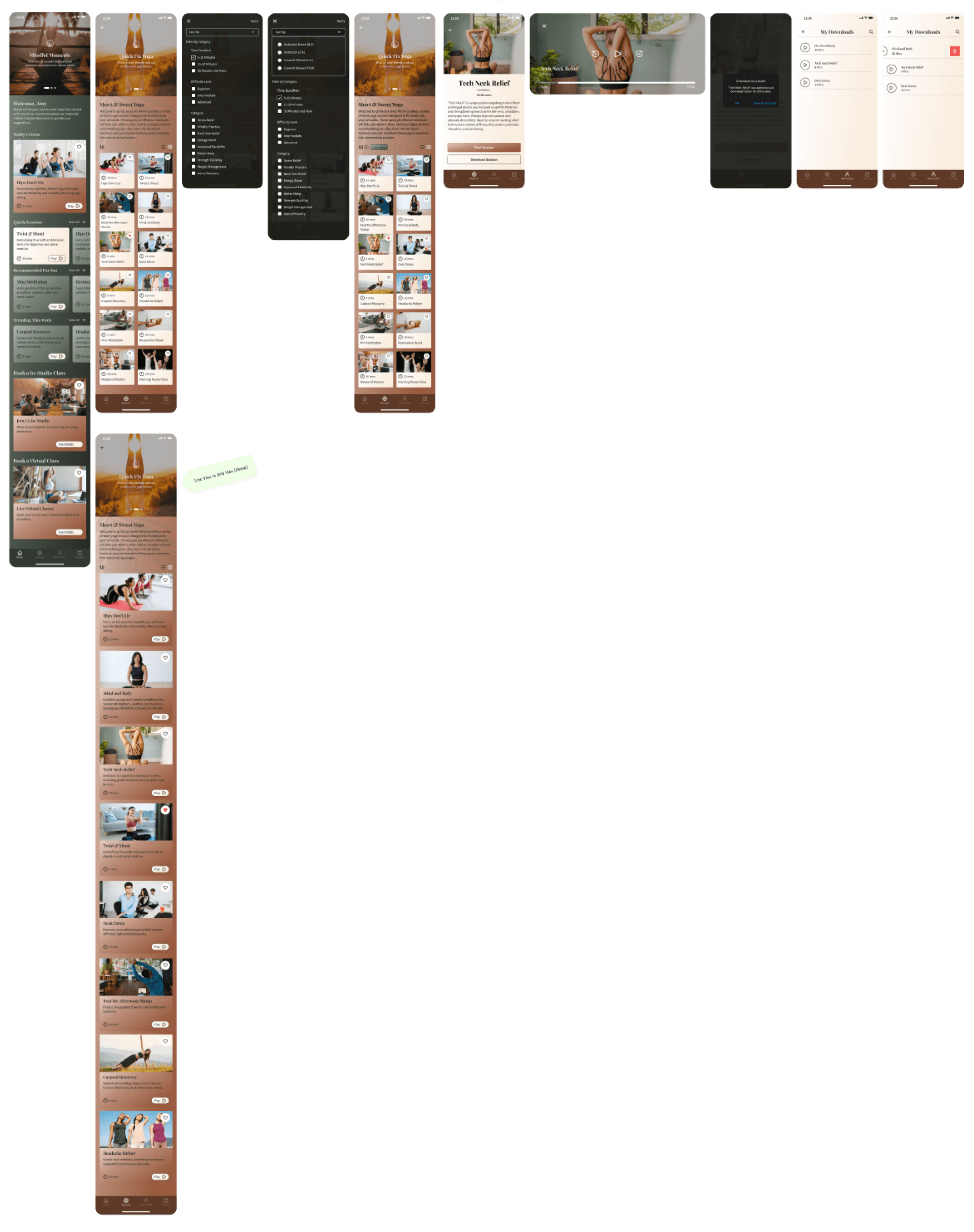
High Fidelity Wireframes
This stage allowed me to test how the chosen colors, typography, spacing, and UI elements harmonized, providing a realistic preview of the user interface.
It also highlighted areas needing refinement, ensuring features supported user decisions and enhanced their experience.
Iterations felt more dynamic and "real-time," allowing me to make quick adjustments based on visual feedback and usability testing.
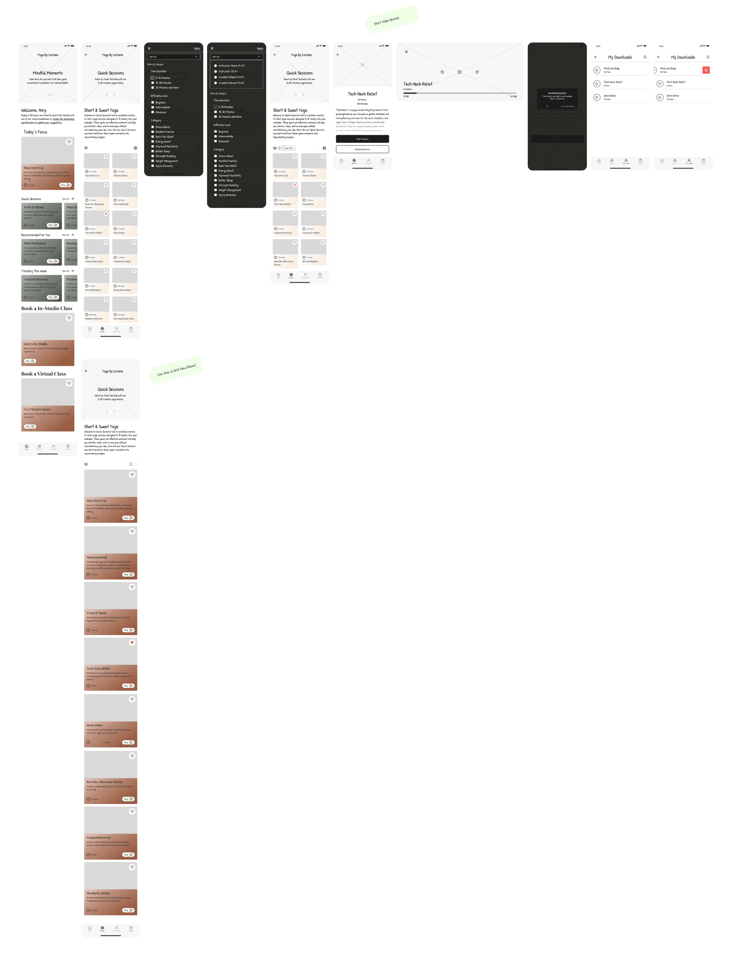
Prototyping
Prototyping was both a challenging and exhilarating part of the project. The process involved learning to animate elements, creating smooth transitions between screens, and ensuring every element is connected correctly to its corresponding feature. This technical aspect was frustrating at times but incredibly rewarding. Prototyping allowed me to visualize user interactions in real-time, providing valuable insights into how each screen and transition affected user decisions. It was especially gratifying to see the prototypes in action during usability testing, demonstrating the effectiveness of our design decisions and interactions.


Usability Testing
The usability test for Yoga by Loriana evaluated key features: onboarding personalization, joining and downloading a Quick Fix yoga session, and booking an in-studio class. The test included predetermined features to streamline the process.
Key Learnings:
Success Metrics:
100% of users completed the test.
61% followed the directions; 39% were distracted or forgot instructions.
Average Time on Task: 3.14 minutes
Average Clicks: 49 clicks
Misclick Rate: 27%
Immediate Actions:
Some users found subheadings too lengthy.
Users found the "Play" button label misleading and were confused by "Start Session" vs. "Download Session". Terminology between "Quick Fix" and "Quick Session" was inconsistent.
Booking options were unclear, and duplicate class names caused confusion.
The "Discover" icon did not fit a yoga app, and the introductory content for Quick Fix Yoga under "Home" was inconsistent with sessions under "Discover".
User Interface Suggestions:
Adjust UI colors, making tones softer and more familiar to Yoga practices.
Make Google/Facebook/Apple buttons more subtle.
Insights for Iterations
Iterative design, refined through user feedback and testing, guided my informed decisions.
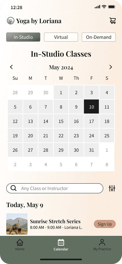
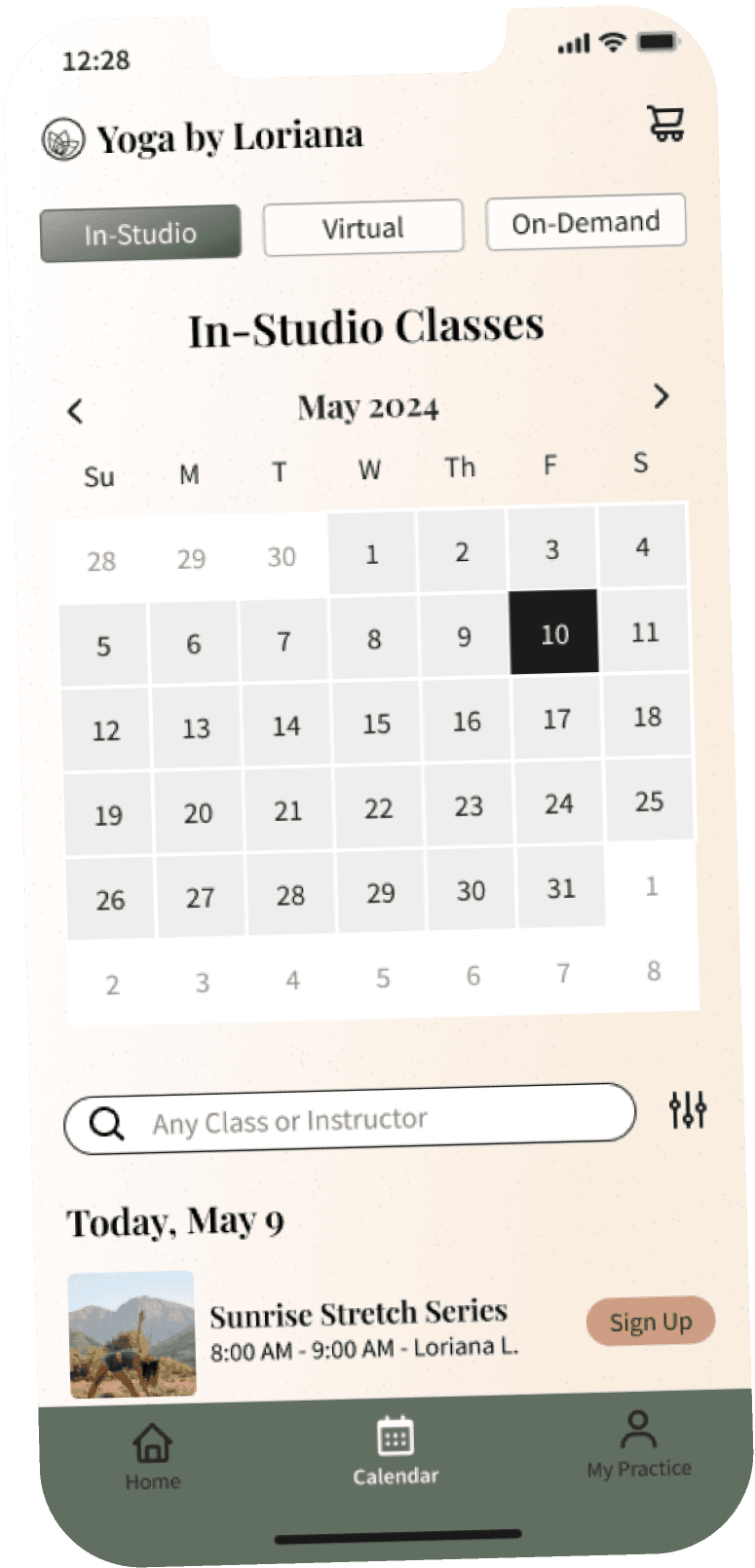
Streamlined Navigation: I moved Quick Fixes to the Home navigation for simplicity, as users found it confusing in the Discovery nav screen.
Consistent Terminology: Standardized the names to Quick Fix Yoga to avoid confusion among users.
Filtering vs. Sorting: Clarified their distinct roles, improving the user journey. Adjusted screens like 'Time Duration' and 'Difficulty Level'.
Interface Clarity: Revised color placements for a clean, clear interface that resonated with users and stakeholders.
Future Iterations: Plan to expand categories like Discovery based on continued user feedback and insights.
Early Iteration
Final Iteration


Insights for Iterations
Distinguishing Booking Options
On the home screen, some users felt the booking options for in-studio and virtual classes were indistinguishable. They mistook in-studio as an option for a class on the app rather than a category of services.
I iterated on the UI, adjusting colors and removing background fill on the ‘book a class’ card components for clarity. Additionally, I removed the "like" button for further clarity.