

BellProperties.com
Responsive Web Design
by Kit Siu
Role:
UX/UI Designer
Duration:
65+ Hours
Project Type:
Responsive Web Design
Tools:
Figma, Lyssna, Adobe Photoshop


Problem Statement
Property owners and renters face significant difficulties finding specific information on the Bell Properties website, resulting in underutilization of valuable resources.
Overview
While the current focus of Bell Properties is not on their website, it was a delight working with a real client to explore redesign possibilities. The primary objective of the Bell Properties project was to redesign the website to enhance the user experience for property owners and renters.
This included:
Improving the search and filter functionality to enable users to find relevant information quickly and easily.
Enhancing mobile responsiveness to ensure a seamless experience across all devices.
Creating an intuitive and user-friendly interface to improve overall navigation and user engagement.
Research
To define the problem and audience, I conducted user interviews and a competitive analysis. During the remote interviews with property owners and renters, I asked about their challenges, how they find information, and what features they would find helpful. One user mentioned, "I appreciate the resources but rarely come back after signing up because I can't easily find updates." Key findings included that 80% of users found navigation cumbersome and 65% wanted more personalized content and search options. These insights helped us identify critical areas for improvement.
Competitor Analysis
General unmet needs identified from our competitor analysis:
Lack of effective search, filter, and sort functions.
Hidden or non-functional search features.
Insufficient detailed information on processes and offerings.
Transparent and clear pricing models.
Mobile app availability and enhanced accessibility options.
Improved user interface and user experience.
Click On Image To Enlarge


Key Findings
Exploration Patterns: Users typically explore three pages per visit, often gravitating towards educational vlogs and blogs.
Valued Market Insights: Users value the unique market insights offered by Bell Properties and its differentiated services, comparing favorably to competitors.
Essential Tasks: Owners use the website for essential tasks and information, emphasizing the need for quick and responsive communication.
Customer Trust: Customer testimonials highlight Bell Properties’ reliability and the stress-free experience it provides, noting its user-friendly services and balanced, professional design as key factors that build trust.
Navigation and Search: Users find navigation and search within the blog and content sections cumbersome, often unable to locate older, specific content easily. A user noted, "Sometimes I remember reading a fantastic article on maintenance tips a few months back, but now I can't seem to find it."
Mobile Experience: The mobile experience requires improvement for better content scaling and menu navigation. (Currently, the mobile responsive behavior is horizontal viewing).
Sense of Isolation: Users currently feel a sense of isolation, lacking visibility into the experiences and stories of fellow property owners.
Affinity Mapping
User Experience Takeaway:
Despite a positive outlook, users encounter issues with inconsistent management interfaces across services. Users expect a straightforward, responsive website that consolidates management, offers engaging content, and facilitates easy navigation and quick communication, distinguishing Bell Properties from less personal, corporate alternatives.
Content and Resources_Takeaway:
Property owners value a content-rich website offering easy access to blogs and vlogs, with a desire for improvements in content discovery, educational tools, and resources tailored to commercial interests and market trends.
Target Audience Takeaway:
Property owners and tenants commend the website for its personal touch and educational resources, yet they express a need for more interactive community features and direct communication channels to better support their experiences.
Trustworthiness Takeaway:
Customer testimonials highlight Bell Properties' reliability and the stress-free experience it provides, noting its user-friendly services and balanced, professional design as key factors that build trust.
Click On Image To Enlarge

Click On Image To Enlarge

User Persona
DESIGN

Collaborative Design Process
Working closely with stakeholders, I ensured the consistent application of primary colors and typography across the site, maintaining uniformity in heading sizes, line heights, and spacing for a cohesive user experience. I also recreated the logo and implemented it as a component for consistency throughout. This collaboration was key to aligning the design with the brand’s vision and goals, resulting in a professional and cohesive visual identity.
Click On Image To Enlarge

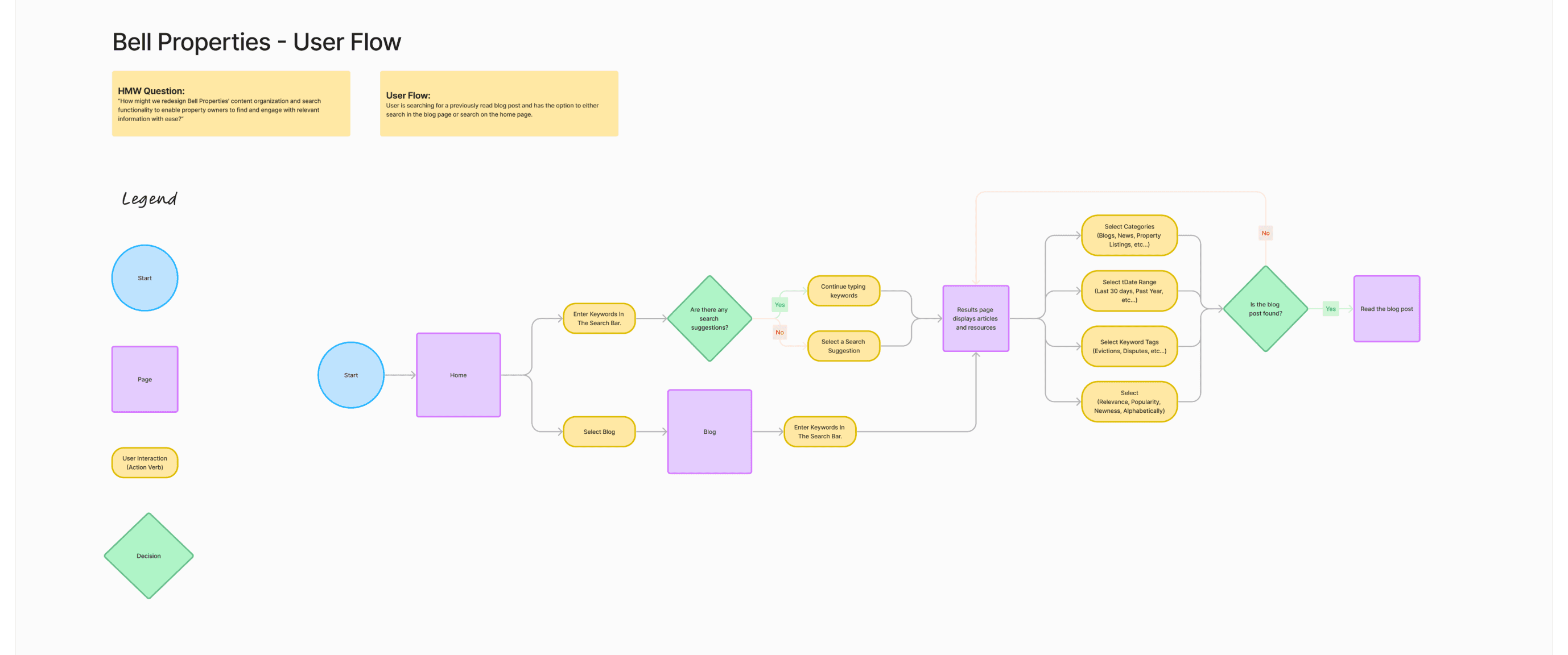
User Flow
The user flows were designed to simplify the search and filter process, addressing the core problem of users struggling to find specific information. The key flow involves:
Initiate Search: Users start from the homepage or the blog page, entering keywords in the search bar.
Search Suggestions: The system provides search suggestions based on the entered keywords.
Filter Options: Users can refine their search using filters such as categories, date ranges, and keyword tags.
Results Page: The results page displays articles and resources based on the refined search criteria.
Access Content: Users can select and read the desired blog post or resource.
These flows ensure a seamless experience, allowing users to quickly find the information they need without frustration.


Mid Fidelity Wireframes
In the low-fidelity wireframe stage, I focused on introducing more white space to the Bell Properties site, decluttering the existing layout to achieve a balanced rhythm of images, text, and hierarchy. I iterated multiple times, ensuring each section was cohesive and related, while consolidating or removing unnecessary and repetitive sections, like contact us forms on every screen. Clear CTAs, consistent language, and filter tags were implemented to guide the user effectively.
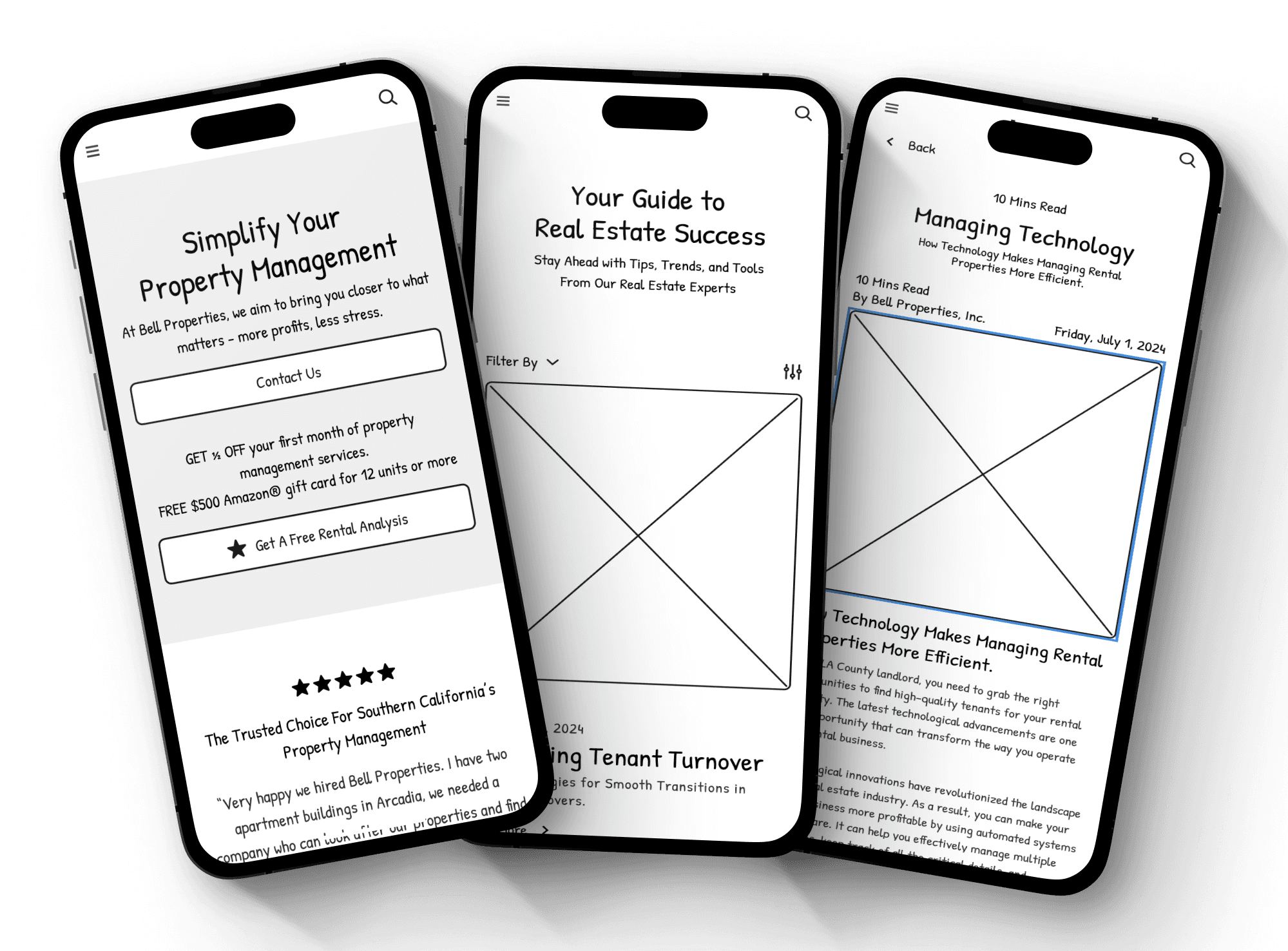
High Fidelity Wireframes
In the high-fidelity wireframes, I refined the designs while keeping Bell Properties' branding in mind. I selected imagery that aligned with the company's business and user goals, ensuring visual consistency throughout the mobile-first responsive website. Components were created for both mobile and desktop, including the navigation bar, information cards, drop-down menus, filters, and hero carousels. This approach made iterations smoother and easier, maintaining a cohesive brand identity across all elements.


1
Phone Number Placement:
Before: The phone number was prominently displayed at the top.
After: Removed the phone number for a cleaner header, placing emphasis on navigation and CTAs.
2
Client and Tenant Logins:
Before: Logins were less distinct and blended into the navigation.
After: Made the Client and Tenant Login buttons easily accessible.
3
Navigation Simplification:
Before: Redundant categories like "Rentals," "Residents," and "Tenant."
After: Streamlined sitemap and reduced similar categories for navigation clarity.
4
Hero Image Overlay:
Before: A block overlay awkwardly covered the hero image.
After: Removed the overlay for a more visually appealing and inviting homepage.
5
Call-to-Action (CTA) Button:
Before: CTA button color and size was inconsistent, lacking cohesion.
After: Unified the CTA button color with the overall UI palette for a cohesive look and stronger visual impact.
6
Typography:
Before: Very thin and inconsistent typography made text hard to read and disrupted the visual flow.
After: Used consistent, bold typeface in headings for better readability and a more polished, professional appearance.
7
Logo:
Before: The logo varied in size and scaled to 3x it’s size with scroll interaction.
After: I recreated the logo as a component for consistency across screens.
8
Search Feature:
Before: Only available in the blogs section and was non-functional.
After: Implemented a functional search feature across the site for easy information access.

1
Heading and Subheading Consistency:
Before: All caps for headings and lowercase for subheadings, inconsistent across the site.
After: Updated to title case for both headings and subheadings for uniformity.
2
Font Choices:
Before: Multiple fonts introduced in headings.
After: Minimal font options used to maintain a clean, cohesive look.
3
Alignment and Functionality of Cards:
Before: Cards did not align well at the bottom, and links were not obviously functional. The link and arrow icons are almost touching.
After: Cards are aligned, and links are turned into clear CTA buttons.
4
Use of the Rule of Three:
Before: Sections had inconsistent numbers of cards (one, two, or three).
After: Standardized to three cards per section for a consistent visual system.
5
Spacing Consistency:
Before: Inconsistent spacing between images and typography.
After: Applied consistent spacing for a balanced, rhythmic layout.
6
Overall Design:
Before: Disjointed visually cluttered and inconsistent.
After: A cohesive, user-friendly design that enhances readability and functionality.

1
Navigation Bar:
Before: Unfamiliar layout with poor spacing and close icon-text proximity.
After: Center-aligned, evenly spaced for better readability and accessibility.
2
Text Clipping:
Before: Navigation bar cut off two lines of heading text.
After: Clean layout with no text interference.
3
Hero Image and Text Overlay:
Before: Poorly scaled hero image with excessive text overlay, multiple fonts and weights.
After: Optimized hero image with minimal, consistent text overlay.
4
Font Consistency:
Before: Multiple fonts and different weights were used, creating a cluttered and inconsistent look.
After: Simplified the font choices, using consistent fonts and weights to maintain a clean and professional appearance.
5
User Experience:
Before: Cluttered, inconsistent design and poor image scaling.
After: Improved visual hierarchy and spacing, enhancing overall usability and aesthetics.
Adding a Filter Feature
Along with the search feature addition, I introduced a comprehensive filter feature for both desktop and mobile versions to address user needs identified in our research.
Users expressed difficulty in finding specific blog content, so the filter allows them to refine their searches by date range, audience type (owners or tenants), property type (residential, commercial, industrial), and content type (blogs, videos, tutorials).
Additionally, tags like "Rentals," "Property Management," and "Market Trends" help users quickly locate relevant articles. This functionality enhances the user experience by making information easily accessible and reducing search time.

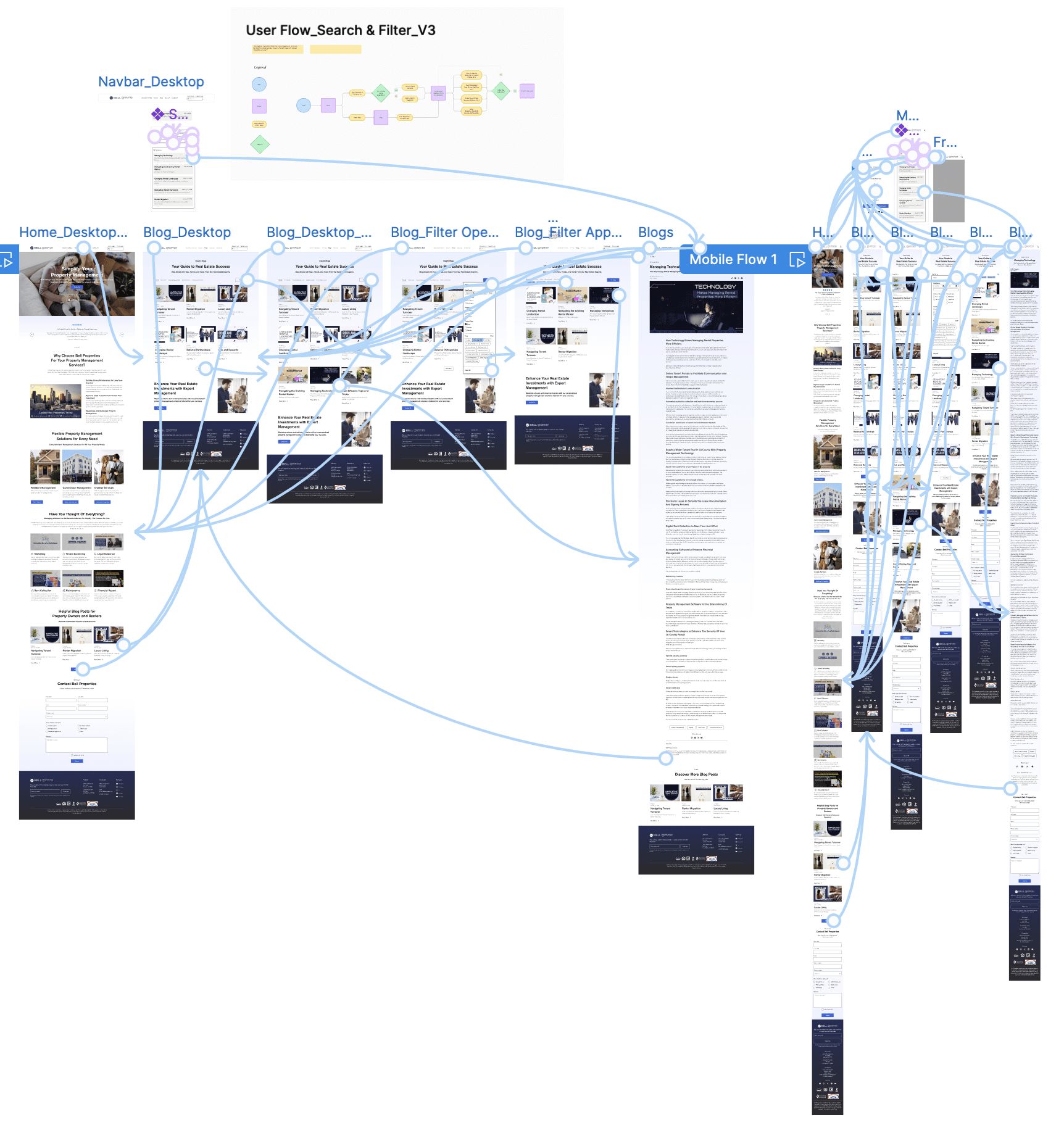
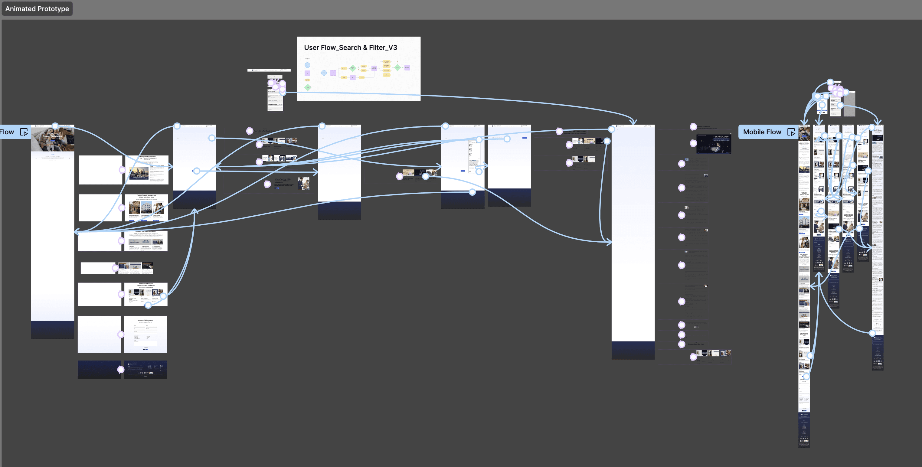
Prototyping
The prototype ensured a smooth usability test, incorporating engaging elements like subtle scroll animations. It aimed to gather user feedback on both the overall experience and the visual aesthetics.

Usability Test
My usability test focused on evaluating the search and filter functionality on the Bell Properties website. Participants were tasked with finding a previously read technology blog, using both desktop and mobile interfaces.
Insights
Success Metrics
Users took an average of 1 minute and 5.31 seconds to locate the desired blog post using the search bar and filter options.
100% of users successfully completed the task of finding the blog post.
On a scale of 1-5, users rated their satisfaction with the interface and features, with an average rating of 4.04 (80.0%).
Immediate Actions
Enhance Search Functionality: Users felt the animation in searching and search results was slow. Optimizing the search bar’s performance to reduce lag and ensure immediate feedback was essential.
Reduce Irrelevant Results: A few users reported encountering irrelevant search results. Refining search algorithms to prioritize keyword results in blog titles over subject relevancy was suggested.
Simplify Search Results: Users found the search results too detailed. Displaying only essential information in search results was recommended to avoid overwhelming users.
Additional Insights
Content Enhancement: Users recommended more visual content in blogs, suggesting the use of images, infographics, and videos to make content more engaging.
User Recommendations: Adding a feature that allows users to easily share articles or recommend Bell Properties services was suggested.
Modernize Design: Implementing subtle animations and a more modern, minimalist design to make the site more appealing was recommended.
Final High Fidelity Prototype & Future Iterations
Based on the Bell Properties usability test results, several key iterations were made to enhance user experience:
Enhanced Search Functionality:
Observation: Users felt the search animation was slow.
Iteration: Shortened the animation timing to reduce lag and improve user retention.
Future Tests: Measure user satisfaction and task completion times to ensure effectiveness.
Content Enhancement:
Observation: Users suggested more visual content in blogs.
Iteration: Added images to blog sections to break up text and increase engagement.
Future Tests: Track user engagement metrics like time on page and scroll depth.
User Recommendations:
Observation: Users wanted to share Bell Properties content.
Iteration: Added a "copy link" icon to blog posts for easy sharing.
Future Tests: Monitor the use of the sharing feature to assess its effectiveness.

Key Takeaways
Working on this project taught me the importance of revisiting research to ensure we were on the right path and asking the right questions to uncover user pain points. Each iteration, from adding subtle animations to refining the homepage, was a step towards creating a more seamless and engaging user experience. I am most proud of how the website redesign promotes a seamless user experience and addresses key pain points. Moving forward, I plan to conduct A/B testing on new features and continue gathering user feedback for ongoing improvements. This project has significantly expanded my skills and understanding of user-centered design, and I am eager to apply these insights to future projects.
Thank you for reading!
