
Place Pulse
Place Pulse is a community-centric web app that enhances neighborhood engagement by featuring local events, interest-based groups, and people connections. Pulse Place makes it easy for residents to connect and participate in local activities, and contribute to the vibrancy of their neighborhood. It's designed to strengthen community bonds and encourage local participation.
Role:
UX/UI Designer
Duration:
160+ Hours
Duration:
Practicum End to End Web Application

Background / The Problem
My project with Place Pulse aimed to help people feel more connected to their local community. Existing platforms were too general and didn't feel personal. My goal was to make local events meaningful and easy to find, particularly for individuals who are new in town.
Welcome To My Design Narrative
Crafting Connections In Communities


Research:
Uncovering Insights Through Exploration
User Interviews / From Global to Local Insights
Starting Wide: Relocation App Exploration
During my research, a common thread was revealed: regardless of the distance moved, individuals faced significant challenges in integrating into new communities. The pain points were clear - a sense of disconnection, difficulty in discovering local events, and a longing for personalized community interactions.
Narrowing Down: Community Engagement Focus
As insights were gathered, the scope of my project narrowed. I learned that while moving logistics are complex, the emotional and social integration into a new community post-move was an underserved area. Users craved a solution that made discovering local events and groups not just easy but also meaningful and tailored to their interests.
Insights That Shaped Place Pulse
To understand how people connect with their community, I talked to 5 people and asked them about their experiences. Here's what they said they wanted:
Emotional and Social Needs: The transition to a new place wasn’t just about the physical relocation but establishing emotional and social roots.
Discovery and Personalization: There was a significant demand for an effortless way to discover local community events that matched individual preferences.
Intuitive Interface: Users emphasized the importance of a simple, user-friendly interface that made navigation straightforward, removing barriers to community participation.
What Did I Learn?
This journey through user feedback underscored a craving for a platform that feels less like a bulletin board and more like a friend guiding you to your next adventure.
Hypothesis
The research culminated in a hypothesis that if Place Pulse could offer a user-friendly platform emphasizing local inclusivity, easy discovery of events and groups, interactive features for engagement, and real-time updates, it would effectively meet the needs of individuals looking to forge meaningful local connections. This hypothesis was grounded in a comprehensive understanding of the relocation experience, highlighting the transition from a broad exploration of moving challenges to a focused solution on community engagement.
Define: Blueprints of Design
Defining Problems and Solutions
In the "Define" phase of our Place Pulse project, I took our broad research findings and began to carve out a specific niche for the app. The competitive analysis highlighted a gap in community engagement tools, which led to the birth of Place Pulse.
The Persona
I developed personas based on our research findings, including Alex, Oliver, and Caroline, to capture diverse user needs and pain points. Caroline's persona, with her desire for deeper community ties after moving, became my guide. Alex's financial foresight and Oliver's dream-chasing aspirations influenced the app's development, but Caroline's need for social integration shaped my core focus.
Pain Points for Alex, Oliver, and Caroline
For Alex, the Budget Planner:
Alex grapples with the anxiety of hidden costs during his relocation.
He is wary of the job market's unpredictability and career growth in a new city.
There's a risk for him of overshooting his budget due to unforeseen expenses.
For Caroline, the Community Integrator:
Caroline fears the loneliness that might come with her move.
She's concerned about finding her place and voice within a new community.
Caroline finds it difficult to locate authentic, local experiences that resonate with her.
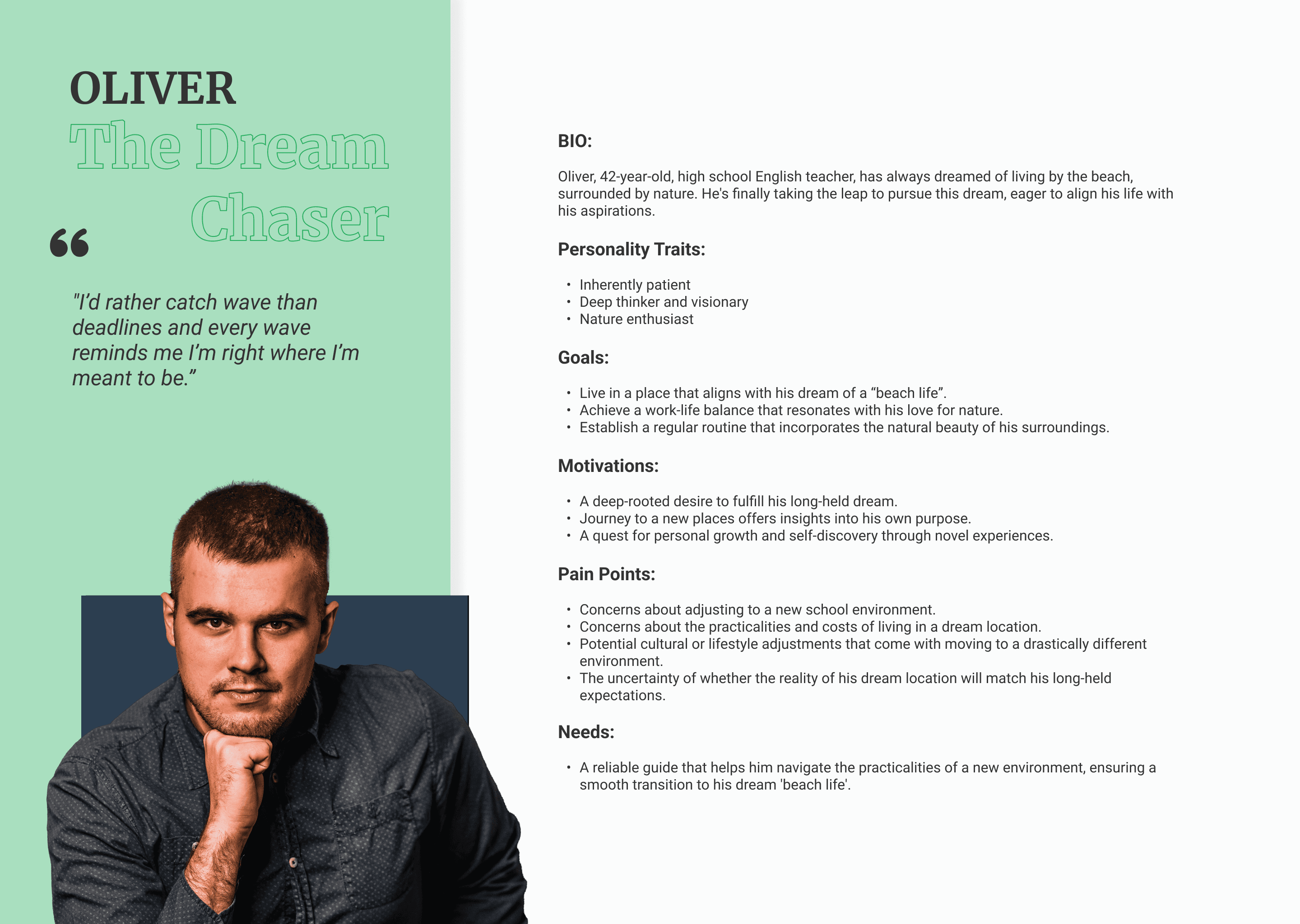
For Oliver, the Dream Chaser:
He's uncertain about the logistics and costs of relocating to his dream coastal locale.
Oliver contemplates the cultural or lifestyle changes that accompany such a move.
He's unsure if his ideal location will live up to his long-held expectations.
Needs and Wants
Prioritizing Caroline's persona allowed me to focus my design on the needs and wants most critical to my user base:
Needs: An intuitive platform for discovering and engaging with local events and groups, emphasizing ease of use and personalization.
Wants: Opportunities for genuine community involvement that go beyond mere attendance, like interactive features that encourage active participation and communication.
This phase was pivotal, as it transitioned my understanding from general pain points to actionable insights. It set a clear direction for Place Pulse, aiming to fill the existing void in community engagement by providing a platform that’s not just easy to navigate but deeply personal and connected to the fabric of local communities.
Click On Images To Enlarge


Click On Images To Enlarge

Click On Images To Enlarge

Task Flows and User Flows
After researching and defining the problem, I created two task flows and a user flow that combined the two task flows. This was an important step in moving from just ideas to practical plans.
Tasks Flow & User Flows
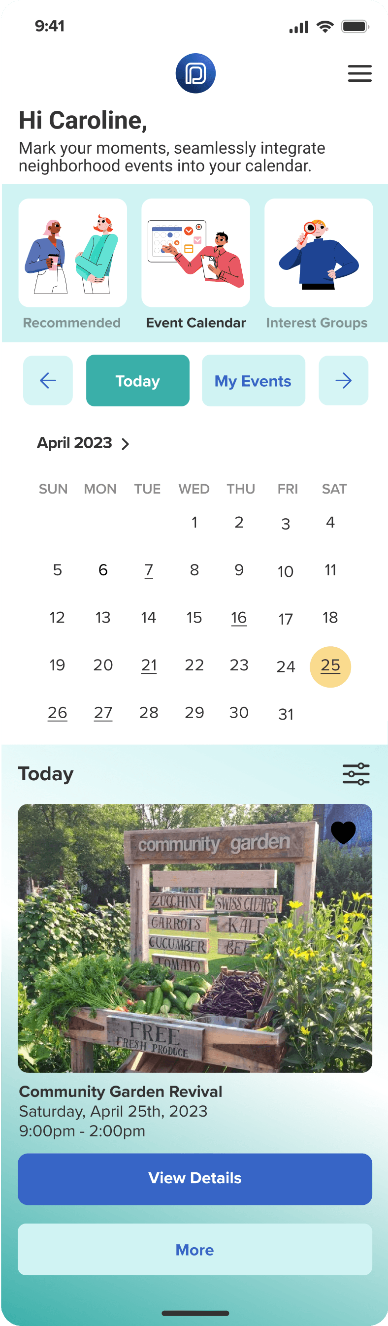
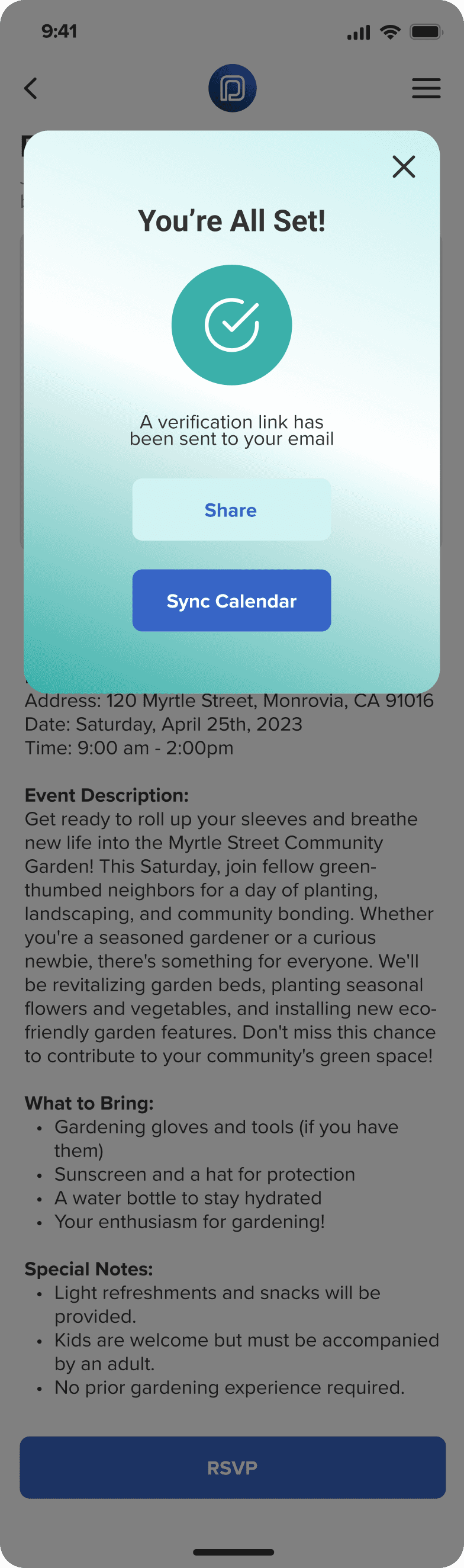
Event discovery and RSVPing to an event: This flow helps users find events and easily sign up to attend.
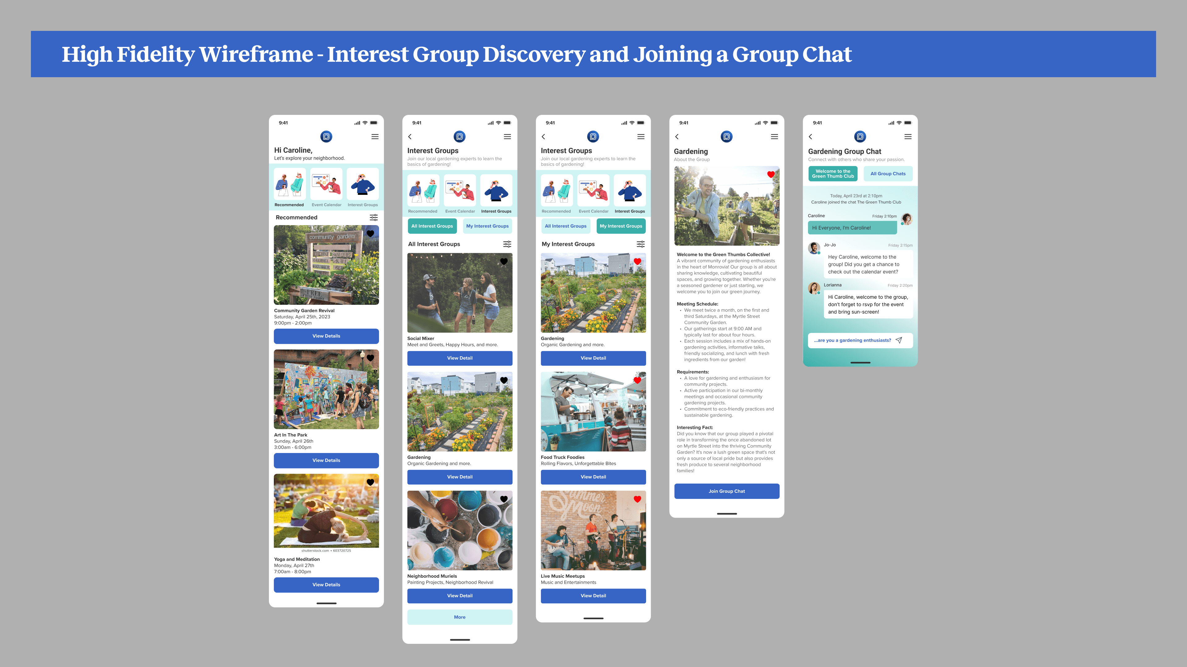
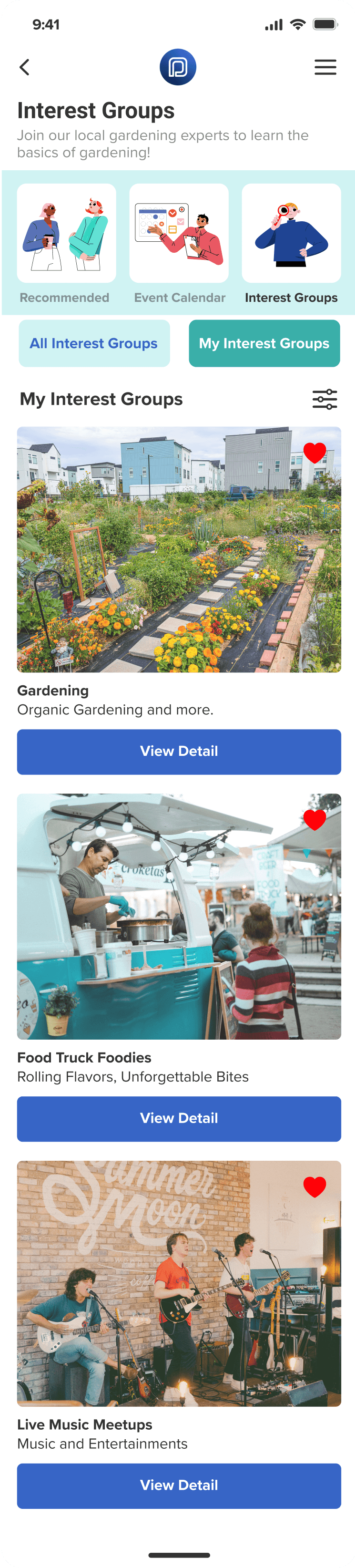
Interest group discovery and joining a group chat: This flow allows users to discover interest groups and join group chats.
What I learned:
These flows helped me understand how users would move through the website.
I looked for any confusing or difficult parts. If something was confusing to me, it might be confusing for a user, too.
The insights I gained from these flows helped me make the website easier to navigate and removed any unnecessary steps.
Creating a Brand
Moodboard
The mood board is a snapshot of community life—lively, diverse, and engaging, directly inspired by user insights to reflect the app's communal spirit.
Color Palette, Typography, and Brand Logo
My color choices—dependable blues, fresh greens, and solid neutrals—are drawn from user preferences for a welcoming and trustworthy platform.
Typography
I selected clear, friendly typefaces to ensure my messages resonate inclusively, as users suggested they wanted readability with a touch of warmth.
Logos and Icons
The logo was designed to symbolize a continuous loop resembling the two P's in Place Pulse, an unending journey of community engagement. Each design choice intentionally addresses user needs for clarity, accessibility, and engagement.
Click On Images To Enlarge

Click On Images To Enlarge

Click On Images To Enlarge

Click On Images To Enlarge

Click On Images To Enlarge

Click On Images To Enlarge

Click On Images To Enlarge
Crafting an Intuitive Experience
In the Design Phase:
I adopted an iterative approach, refining my wireframes from early sketches to detailed layouts. The aim was to craft an interface that was both aesthetically pleasing and highly functional, making sure it met the community's needs.
Low-Fidelity and Mid-Fidelity Wireframes
I refined the core concepts such as event discovery and RSVP processes, ensuring users could visually and effortlessly complete tasks.
I was able to see a detailed view of the UI for enhanced clarity and confirmed that accessibility considerations were integrated.
In this stage, I was able to lay out the navigation structure more definitively by consistently placing navigation cards across different pages to ensure intuitive user navigation.
High-Fidelity Wireframes / What I Learned and How It Applied To Design
Reflecting on user interviews and feedback, I've refined the functionality and aesthetics to align with the community’s needs. With attention to detail, these wireframes present a polished interface that balances innovative features with intuitive navigation, ensuring every interaction feels familiar and engaging.
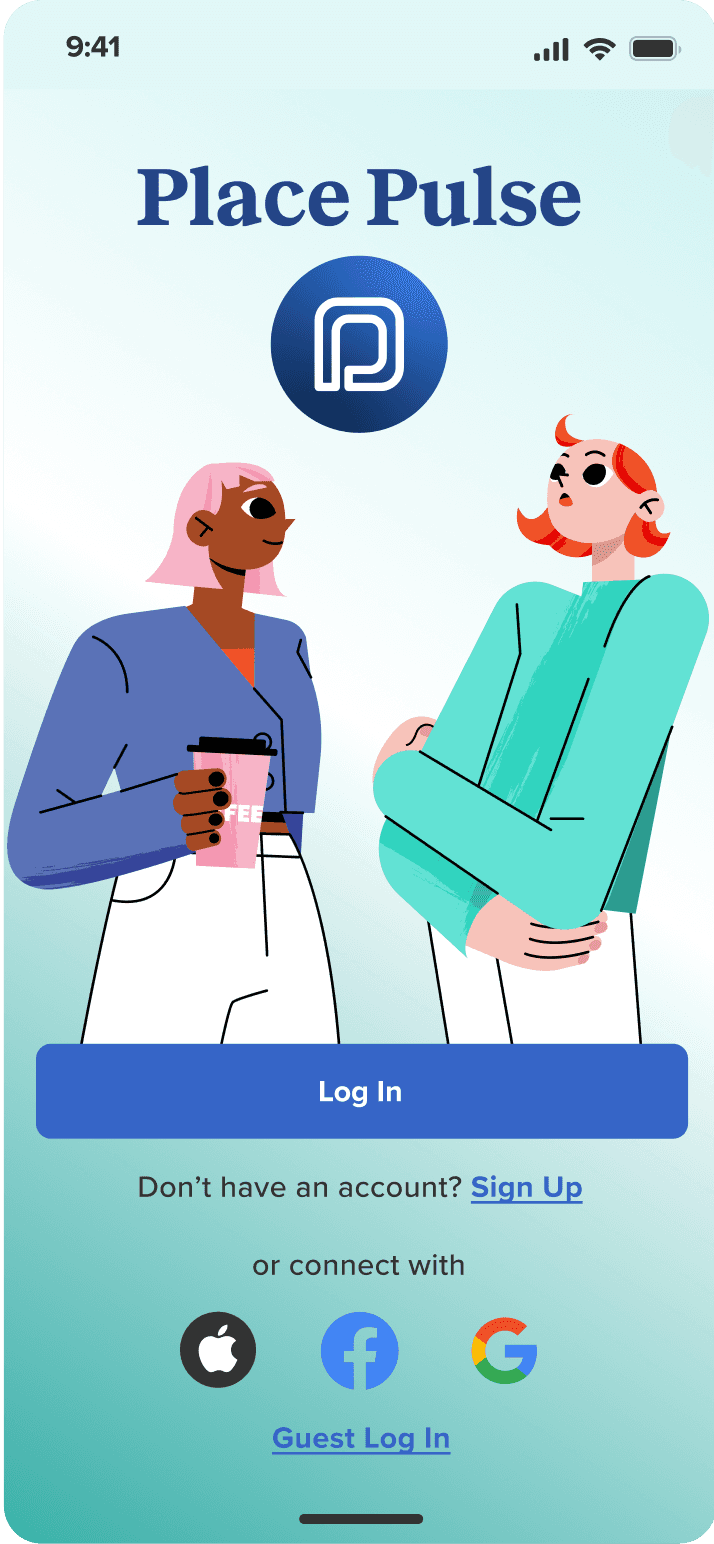
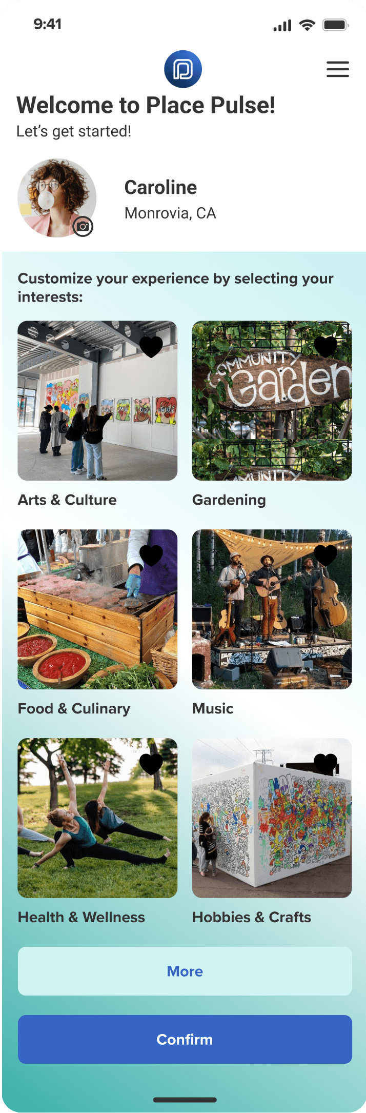
My research revealed that users wanted a quick, hassle-free onboarding experience. I responded with a streamlined sign-up process that is quick and personalizes the app's features.
User feedback highlighted a need for a clear, intuitive path to event participation. I designed an RSVP feature that directly addresses this by providing a one-tap solution to event discovery and commitment.
Place Pulse offers a clear path for discovering and joining interest groups, aligning insight that users want to easily find groups that match their hobbies.
The prompt to “Say hello” and the conversation starters provide a solution to the problem of initiating engagement within new groups, as identified in user interviews.


Iterating for Excellence
Refining Through Testing
Testing focused on evaluating the ease of discovering and RSVPing to gardening events and engaging with interest group chat. The aim was to ensure intuitive navigation and meaningful interactions within the app.
User Test and Insight
I refined the layout to highlight key actions, such as joining a community group and ensuring visibility and accessibility.
Micro-interactions were fine-tuned, including button animations and feedback messages, to enrich the user experience.
The color scheme, iconography, and visual elements were validated against accessibility standards to guarantee inclusivity.
Ensuring the navigation bar was fixed in position became a priority for consistent usability and ease of navigation.
Long descriptive paragraphs were converted into bullet points to improve the reading experience.
Functional filters and list-view options were incorporated into the calendar events to allow users more control over their search and customization.
To enhance satisfaction, I challenged assumptions about user preferences for clicking on pictures versus buttons.
The success metrics were determined by task completion rates and the intuitiveness of the interface, leading to high user satisfaction; notably, 4 out of 5 users found the navigation tasks to be straightforward.

Reflecting On My Journey
The Place Pulse project was a deep dive into UX/UI design, teaching me the critical role of iterative testing and feedback. By addressing the disconnect in community engagement, I crafted a solution for personalized connections, honing my skills in empathetic design and advocacy. This journey has not only solved a user need but also enriched community interactions, showcasing my commitment to user-centered design and translating insights into tangible outcomes.
Thank you for reading!